- Web Design
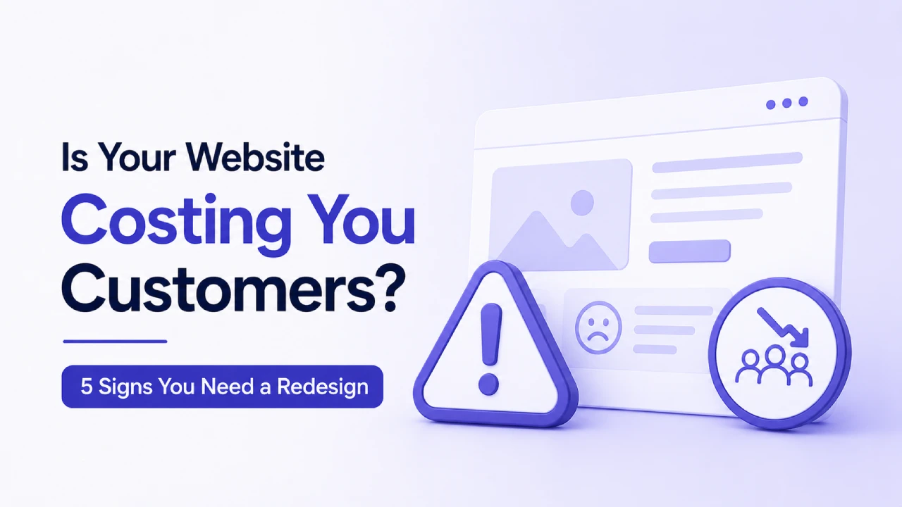
Is Your Website Costing You Customers? 5 Signs You Need a Redesign

Picture a prospective customer who heard your name from a colleague, decided to look you up before getting in touch, opened your site on their phone while on the train home, and closed it inside fifteen seconds without reading a word. You never knew they were there. The analytics registered a bounce. That was the end of it.
This isn’t an unusual sequence. It plays out constantly for businesses whose websites have quietly drifted out of step with what visitors actually need, often without the owner noticing because they stopped really looking at the site years ago. There’s no alarm that goes off. Nobody emails to say your site was slow or your layout was confusing. They just don’t call.
The five signs that follow are the most common underlying causes of this kind of invisible customer loss. Some are fixable without a full rebuild. Others are a stronger signal that the site needs to be approached from scratch. Working out which category your site falls into starts with an honest look at each one.
How a Website Quietly Loses Business Without Anyone Noticing
The Gap Between Visits and Enquiries
If your analytics are properly configured, you already have the data to start diagnosing this, but most business owners either don’t check it regularly or aren’t sure what to look for when they do. Pull up the bounce rate for your main service pages. If it’s sitting consistently above 70 percent, something about the first impression is causing people to leave before they’ve engaged. That could be load speed, it could be that the page doesn’t match what the search result or ad they clicked promised, or it could be that the layout gives them no clear reason to stay and scroll.
Conversion rate tells a different part of the story. Visitors who stay and read but still don’t enquire are usually hitting friction somewhere in the path between being interested and taking action. The form is too long. The phone number is hard to find. The call to action is buried below the fold. There’s no obvious next step. None of those problems show up as a single dramatic number; they show up as a conversion rate that should be higher than it is and never quite gets there.
Why Business Owners Don’t Notice Sooner
Mostly because familiarity dulls perception. You built the site, or were closely involved in building it, and you’ve looked at it enough times that you no longer see it the way a stranger does. The design that felt fresh three years ago looks different now, not because it changed but because everything around it has. Competitors have redesigned. Design conventions have shifted. Mobile usage has increased and mobile expectations have gone with it. The gap between your site and what a first-time visitor expects tends to widen gradually rather than suddenly, which is why it rarely feels urgent until something prompts an honest look.
Sign 1: Your Website Takes Too Long to Load
Slow Loading Loses People Before They Have Read a Single Word
Here’s the blunt version: most people don’t wait for slow websites. They close them and try the next option in the search results. Google’s own research on this has been quoted so many times it risks sounding like a cliche, but the underlying numbers are worth sitting with. By the time a page takes five or six seconds to load on a phone with average signal, the majority of people who started waiting have already left. The meaningful drop-off starts around three seconds, which is a threshold a lot of small business websites are exceeding, often without the owner having any idea.
For service businesses specifically, the timing of this matters a lot. Someone searching for a solicitor, a builder, an accountant, or a designer on their lunch break has maybe ten minutes and three or four options open in tabs. If your site is the slow one, they don’t wait. They get their answer from the one that loaded while yours was still rendering the header.
What Usually Makes a Business Website Slow
In most cases it traces back to a handful of very fixable things. Images uploaded at full camera resolution rather than compressed for web use are probably the single most common culprit. A homepage hero image that weighs three or four megabytes adds noticeable load time even on a solid connection, and on a mobile with average signal it can push load time past the point where visitors reliably leave. Beyond that, cheap shared hosting that throttles resources when the server is busy, and websites built up over years of plugin additions that nobody ever audited for performance impact, are the other recurring causes.
How to Check Your Website Speed Without Technical Knowledge
Google’s PageSpeed Insights is free and gives results in about thirty seconds. Type in your URL and it gives a score out of 100 for mobile and desktop separately, alongside specific recommendations for what’s causing the slowdown. A mobile score below 50 is a real problem. Below 70 is worth addressing. The mobile score matters more than desktop, both because mobile is where most of your traffic likely comes from and because Google uses mobile performance as part of its ranking signals. If you haven’t run the site through this tool recently, do it before assuming speed isn’t an issue.
Sign 2: The Mobile Experience Is Awkward to Use
How Your Customers Are Actually Browsing
Open your website on your phone right now. Not in a desktop browser with the screen reduced; on your actual phone with your actual thumbs. Read the homepage text at normal size. Tap the phone number. Try to fill in the contact form. Navigate to a service page. If any of that produced a moment of friction, an instinct to pinch and zoom, a button that required two attempts, a form field that opened the wrong keyboard, your mobile visitors are having that same experience every time they visit.
Check your analytics device breakdown if you haven’t looked recently. For most service businesses, phones account for somewhere above half of all visits, often closer to 60 or 70 percent depending on the industry. So the desktop version of the site, however carefully built, is what the minority of visitors actually see. Google switched to using the mobile version of sites as its primary ranking signal several years ago, which means a website that’s awkward to use on a phone tends to be sitting lower in search results than it should be, on top of already converting the mobile visitors who do arrive at a lower rate.
What Visitors Actually Experience on a Poorly Optimised Mobile Site
There’s a meaningful difference between a website that’s responsive, meaning it scales to fit different screen sizes, and one that was genuinely designed with phone use in mind. Responsive resizing can still leave you with text that’s technically readable but cramped, navigation that collapses into a menu icon that doesn’t quite behave, contact buttons that are sized for a mouse cursor rather than a thumb, and images that load at full size on a slow mobile connection because nobody compressed them. None of those things break the site completely. They just make it slightly unpleasant to use, and slightly unpleasant is usually enough to push someone toward the competitor whose site didn’t cause any friction.
The Specific Things Most Often Wrong on Mobile
Navigation menus that require multiple taps to find anything. Phone numbers displayed as plain text rather than tappable links. Footer contact details that are tiny and bunched together. Forms that open the wrong type of keyboard for the field, a numeric keypad for a name field or a regular keyboard for a phone number. Images that load slowly or shift the layout as they arrive. Any single one of these is a small inconvenience; a page that has several of them at once starts to feel like it was built for a different era of web browsing, because in a practical sense it was.
Sign 3: Visitors Arrive but Don’t Enquire, Book, or Buy
Reading Your Analytics Honestly
Pull up your website analytics and look specifically at what’s happening on your main service pages or your product pages. Not just how many people are visiting, but what they’re doing after they arrive. If a meaningful number of people land on your enquiry page and leave without submitting anything, the page has a friction problem somewhere between arriving and taking action. If people are bouncing from the homepage almost immediately, something about the first few seconds isn’t working, whether that’s load speed, design, or a message that doesn’t connect with what they came looking for.
For a service business where the goal is enquiries, a contact form conversion rate below two percent is worth investigating. It doesn’t mean two percent is always the right benchmark, but if you’re getting several hundred visitors a month and a handful of enquiries, the gap between those numbers is telling you something. The uncomfortable question worth sitting with is: if someone genuinely interested in what you offer landed on this page today, would anything about the experience make it harder than it needs to be for them to contact you?
Where Friction Usually Hides on a Service Business Website
Contact details that only appear on the dedicated contact page rather than being accessible from every page are a persistent issue. Someone on a service page who decides they’d like to get in touch shouldn’t have to navigate away and hunt for a phone number. The same goes for calls to action: if the clearest prompt on a page is “learn more” or “find out more” rather than something specific that tells the visitor what happens next, a lot of people will read the page, decide they’re interested, and then not quite know how to proceed.
Form length is another one that gets underestimated. A contact form asking for name, email, phone number, company name, company size, budget, how they heard about you, and a message is doing too much work for first contact. Most of those questions can be answered in the first conversation. The form’s job is to get someone across the threshold; it isn’t the first qualifying interview. Cutting a nine-field form to four fields almost always increases submission rates noticeably.
The Quickest Way to Find Your Actual UX Problems
Ask someone unfamiliar with your business, a friend, a family member, anyone who hasn’t visited the site before, to do a specific task: find your main service, understand what it includes, and get in touch. Watch them do it without helping or explaining. Don’t tell them where anything is. The moments where they hesitate, scroll back up, tap the wrong thing, or ask a question are your UX problems, laid out in real time. This test consistently surfaces issues that weeks of analytics review wouldn’t surface, because you’re watching behaviour rather than inferring it from numbers.
Sign 4: The Design Looks Older Than Your Competitors
What Visitors Decide Before They Have Read Anything
There’s solid research on how quickly people form an impression of a website, and the number is uncomfortable: it’s somewhere in the region of a few hundred milliseconds, not seconds. Before a visitor has read your headline or understood what you do, they’ve already made a rough judgement about whether the site looks credible and current. That judgement is made entirely on visual appearance: layout density, typography, image quality, colour choices, how the page feels on first load. It isn’t fair, but it’s how attention works when someone is choosing between three or four options in a search result.
The visual impression really has nothing to do with chasing trends. What an out-of-date design does is make an unspoken suggestion about the business behind it, something roughly in the direction of: this hasn’t been looked after recently. That suggestion may be completely unfair and entirely wrong. But it tends to form before any conscious thought, in those first couple of seconds before a visitor has processed a word of the content, and it colours how they read everything on the site that comes after.
The Visual Signals That Give a Website’s Age Away
Some design choices date a site more visibly than others. Hero banner images with text overlays using font treatments that peaked around 2016 to 2018. Stock photography of people in business suits shaking hands, usually with a distinctly early-2010s feel to the lighting and composition. Layouts that feel dense and crowded compared to the more generous whitespace most users now expect. Dropdown navigation menus stretching across the top of the page with ten or twelve items. Background textures or patterns that tile visibly. Animated entrance effects that trigger every time a section scrolls into view and slow the page down while doing it. None of these are automatically fatal, but several of them appearing together tends to produce a site that visitors clock as old before they’ve consciously processed why.
The Competitor Check That Takes Five Minutes
Open the websites of three businesses you’d consider direct competitors, ideally the ones you know are winning work you’d want rather than the ones you know are also struggling. Look at all four sites, yours included, as a potential customer would. Don’t look for flaws or advantages; just notice which ones feel more current, cleaner, easier to parse on first arrival. If yours needs more time or mental effort to assess than the others, that’s the answer. Your potential customers are making the same comparison in real time.
Sign 5: The Website No Longer Matches Your Actual Business
When the Site Describes Something That No Longer Exists
This one builds up so slowly that most business owners barely notice it happening. A service gets added to the offering and the team means to update the website but doesn’t quite get round to it. Pricing changes. A flagship case study on the portfolio page is now three years old and doesn’t represent current work. The About page mentions a team member who left eighteen months ago. The homepage description positions the business toward a type of client the business stopped targeting.
Individually, each of those feels minor. Accumulated over a few years, they create a website that describes a version of the business that no longer exists. And for a prospective client doing their research before deciding whether to get in touch, the experience of enquiring about a service that turns out to have been discontinued, or arriving expecting a price point that changed a year ago, damages confidence before the actual business relationship has even had a chance to start.
The Credibility Problems a Stale Website Creates
There’s a subtler kind of damage that accumulates alongside the practical friction. A portfolio section full of work from several years ago draws in clients whose expectations were shaped by those examples, and the gap between what they expected and what they encounter tends to surface early, usually before the first conversation has gone anywhere useful. A team page that lists people who’ve since moved on, or an About section that reads like a company the business has quietly grown out of, prompts questions that a prospective client ends up answering for themselves rather than asking. They tend to answer them cautiously. That often means moving on rather than reaching out, without either side quite knowing what happened.
The Self-Diagnosis Checklist
Run Through These Before Deciding Anything
Check the mobile PageSpeed Insights score: is it above 70? Open the site on your phone and complete the primary action a new visitor would take, without help or foreknowledge. Look at the bounce rate and conversion rate on your main service or product pages in your analytics. Open three competitors’ websites and compare them with yours as a stranger would. Read through every service description, the About page, and the team section and ask whether they accurately describe the business as it exists today.
Two or more uncomfortable answers from that list is a meaningful signal. How much the website is costing in lost customers depends on how much traffic it receives and the value of an average new client, but for most service businesses the maths on a well-executed redesign paying for itself is reasonably short.
What to Do If Several of These Apply
Not Every Problem Means Starting From Scratch
Some of what this list surfaces can be addressed without a full redesign. Speed problems, for instance, often come down to image compression, hosting quality, and plugin overhead rather than anything structural about the site. Fixing those doesn’t require a new design; it requires someone who knows what to look for running a proper performance audit and addressing the main culprits. Similarly, UX friction on specific pages, an overlong form or a buried contact link, can often be improved with targeted changes rather than rebuilding from the ground up.
A full redesign tends to make more sense when several of the five signs are true simultaneously, particularly if the combination includes mobile experience problems, a design that’s dated enough to undermine trust, and content that’s drifted significantly out of step with the current business. Those three together tend to indicate the site was built to a standard that incremental improvements won’t fully solve. The more useful question before committing to either path is a proper audit of which issues are present, how severe each one is, and which approach produces the better result for the specific situation rather than just the most comprehensive-looking scope of work.
Not sure whether your website needs a targeted fix or a proper rebuild? Creative Sweet works with SMEs and service businesses on website projects built around performance and conversion from the start.

Keep reading

- SEO
Open Google and type in a service followed by your nearest town. A plumber, a...
- SEO
Most physiotherapy clinics fill their appointment books through a mix of GP referrals, word of...
- Google Ads
The question gym owners usually ask about Google Ads is whether to run them. The...