

Somebody adds a scented candle to their cart on your WooCommerce store on a Tuesday evening. They tap through to checkout expecting it to be quick. Instead, three separate steps stretch out in front of them on the page. One of the fields is asking for a company name, on an order for a scented candle. The tab quietly gets closed, and that buyer is gone. This exact scenario plays out on WooCommerce stores right across the UK every hour of every day. It also happens to be where a genuinely enormous chunk of ecommerce revenue quietly evaporates, without the store owner ever really knowing it happened at all.
Cart abandonment on the default WooCommerce checkout tends to run somewhere between sixty and seventy percent for most SME stores, and a decent chunk of that is genuinely fixable with better checkout design. One-page checkout is honestly the specific piece of the puzzle that usually moves the biggest needle here for stores in this situation. What follows walks through the process of setting one up properly on WooCommerce. It is written for store owners themselves rather than in developer-speak, and it ends with actionable steps you can genuinely work through this week.
Why Cart Abandonment Sits So High on Default WooCommerce
Understanding why the default checkout quietly leaks revenue is genuinely the first step towards actually fixing it. These problems are honestly not really about WooCommerce itself as a platform. Most of the leakage comes from the specific way the default checkout template is shipped out of the box, together with a handful of assumptions baked into it about how shoppers are supposed to behave.
Every Extra Click Loses Some Percentage of Buyers
There is a genuinely well-established relationship in ecommerce between the number of clicks between cart and confirmation, and the percentage of shoppers who make it all the way through. Every additional page in the flow drops off some percentage of the people who started. Every additional page in a checkout flow drops off some percentage of the people who originally started. Take a multi-step checkout that has cart on its own page, followed by an address step, and then shipping, then payment, and finally an order review page at the end. That flow is honestly asking the buyer to click through five separate loading screens before they are actually done. Each one of those loading screens is another chance for something to distract them, or for a small doubt to creep in and make them second-guess the whole purchase.
Mobile Shoppers Have Even Less Patience
Somewhere north of seventy percent of UK ecommerce traffic now arrives on the site through mobile devices. Mobile shoppers happen to be considerably less patient with any multi-step process than desktop shoppers ever were. A checkout that feels tedious to work through on desktop honestly starts to feel painful on a phone, particularly when the shopper is trying to squeeze the purchase into a spare moment somewhere. It might be during a bus journey or waiting for coffee. This is really why the impact of switching to one-page checkout tends to show up most dramatically inside the mobile conversion numbers.
What One-Page Checkout Actually Means
The phrase gets used loosely across ecommerce marketing, and the specific meaning matters if you are going to implement it properly. Not every checkout labelled as one-page is genuinely delivering the conversion lift the phrase implies.
The Real Definition Is About Cognitive Load
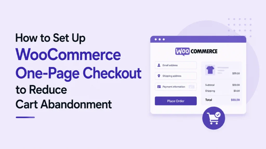
A properly designed one-page checkout puts everything the buyer needs to complete the purchase onto a single screen at once. Cart contents sit visible along one side of the layout, with address details plus shipping options and payment fields visible on the other. Nothing is hidden away behind another click. Nothing requires the buyer to load an entirely new page just to make progress through the flow. The whole experience honestly feels more like filling in a form once and being done with it, instead of working through what feels like a sequence of separate decisions.
It Is Not Just About Removing Pages
Collapsing five pages into one is genuinely necessary but not sufficient. If the resulting single page is honestly a wall of thirty fields with no clear grouping applied, the buyer still ends up bouncing off it. The real magic of one-page checkout comes from a combination of things working together at once. Fewer pages in the flow. Fewer fields on the form. Better visual grouping of what remains. On top of that, a clear order summary that the buyer can reference throughout the process. Just merging the existing multi-step content onto one long scroll usually ends up making things worse than they already were.
Where Most One-Page Attempts Quietly Fall Down
The most common failure mode is honestly a one-page checkout that displays fine on desktop, though it breaks in awkward ways once it lands on a mobile device. Buttons can end up half off the screen. Field labels sometimes disappear on smaller viewports, and the order summary occasionally drops beneath the payment section, where nobody actually sees it until they have already paid for the order. Testing on real devices before going live is genuinely non-negotiable on this. It also happens to be the specific step that gets skipped most often by store owners handling the setup themselves.
How to Actually Set It Up on WooCommerce
The setup process is honestly not particularly technical anymore, provided you use a proper plugin rather than trying to build it manually. What follows is the practical sequence that works for most SME WooCommerce stores.
Step One: Take a Full Backup First
Never touch the checkout on a live WooCommerce store without a proper backup sitting somewhere off the server. A broken checkout on a live store costs real revenue every hour it stays broken, so being able to roll everything back instantly if something goes wrong is genuinely worth the five minutes UpdraftPlus takes to run a full backup. Send the resulting backup off to somewhere like Google Drive while you are at it. Amazon S3 works fine as a destination too. Either way, the backup survives even if the whole server catches fire during the checkout switch.
Step Two: Pick a Plugin That Fits Your Store
There is honestly a handful of genuinely capable one-page checkout plugins for WooCommerce currently on the market. Which one you pick really depends on what the store actually needs. CheckoutWC happens to be the most widely deployed premium option out there, and it handles almost every use case competently. On the free side of things, Fluid Checkout offers a solid free tier that works fine for simpler stores. Meanwhile, FunnelKit adds upsell funnels alongside the checkout optimisation itself, which tends to suit any store also planning to layer in post-purchase revenue as part of the same project. Pick one properly and stick with it. Trying to Frankenstein multiple checkout plugins together is honestly not a path that ends well.
Step Three: Ruthlessly Strip Fields You Do Not Need
This is honestly where the biggest conversion lift on the whole project usually hides. Go through the checkout fields one at a time and ask a simple question about each. Does the business genuinely need this piece of information to actually fulfil the order, and does the law require it. Where the answer to both parts is anything softer than a clear yes, that field is quietly costing money on every abandoned cart. Take company name as one common example that tends to get left on by default and is almost never actually needed. Second address lines can often be optional but are marked as required by mistake, and phone numbers get demanded on quite a few stores where email would honestly work just as well for delivery communication.
The Address Autocomplete Trick Nobody Uses
Adding a UK postcode lookup or a full address autocomplete integration onto the address fields typically saves buyers about thirty seconds each and reduces address errors substantially. Free options exist for simpler stores, and paid integrations like Loqate handle high-volume stores well. This one addition often produces a more noticeable conversion lift than the entire rest of the checkout redesign combined, and it is honestly one of the most consistently overlooked improvements.
Step Four: Test on Real Phones Before Going Live
The browser preview on desktop is essentially useless for judging whether the mobile experience actually works. Get an actual iPhone and an actual Android phone in your hands, and complete a full test purchase from add-to-cart through to confirmation on each device. Any awkward tap targets, any fields hidden by the keyboard when they open, any buttons that feel unresponsive, these all cost real conversions and none of them show up in a desktop preview.
The Trust Signals That Belong Inside Your Checkout
One-page checkout genuinely removes friction from the flow, though it honestly does not automatically build the confidence a buyer needs to actually complete the purchase. That extra confidence tends to come from a handful of specific trust signals appearing inside the checkout itself. Getting these signals right is really what turns a smooth checkout into a properly converting checkout.
Payment Icons Matter More Than Most Owners Realise
Displaying the payment method logos a buyer expects to actually see honestly reduces anxiety at the exact critical moment of entering card details. Visa is the obvious one, alongside Mastercard, with Amex sitting there too on stores that accept it. PayPal usually earns its place on the same row, and Apple Pay together with Google Pay want to be visible wherever those are enabled on the store. These small logos work as visual reassurance in the moment, essentially telling the buyer this checkout is legitimate and the payment they are about to make will process properly. When they are missing entirely, it quietly fires a small “is this actually safe” signal in the buyer’s head. That signal lands at genuinely the worst possible moment.
Security Badges Do Real Work Near the Button
A small SSL padlock icon works well here, or alternatively a “secure checkout” badge placed near the pay button. Either version quietly reassures the buyer that their card details are being properly protected. These signals honestly have to sit where the buyer is actually looking during the moment of decision. That means beside or above the pay button itself. Down in the page footer is not where the buyer’s eyes actually are at that moment. Positioning genuinely matters more here than the specific badge you happen to choose.
The Order Summary That Never Disappears
The buyer needs to see what they are actually paying for and how much it comes to, throughout the entire checkout process. A sticky order summary that stays visible as the buyer scrolls, or a persistent summary column on the right of the page for desktop, delivers meaningful reassurance and reduces the small doubts that quietly cause cart abandonment. Hiding the order summary behind a collapsed accordion is a common mistake that quietly hurts conversion.
Measuring Whether It Is Actually Working
Making the change and then failing to measure the impact of it is honestly one of the more common ecommerce mistakes we see. Getting proper measurement in place is what tells you whether the new checkout is actually helping. It also shows you where any remaining friction happens to be sitting.
Google Analytics 4 handles ecommerce funnel tracking through its enhanced ecommerce events. Setting those events up before the switch to one-page checkout is what gives you a proper baseline to compare against afterwards. The specific metric to watch is honestly the completion rate between cart view and purchase completed. That number should climb noticeably inside a couple of weeks after the switch has gone live. Where it does not, the checkout still has friction sitting somewhere that needs finding. On top of that, running Hotjar or a similar session recording tool alongside your GA4 setup shows you exactly where buyers hesitate on the page, or where they abandon entirely. That qualitative view honestly surfaces problems the numbers alone would tend to miss.
How Creative Sweet Handles WooCommerce Checkout Optimisation
We handle WooCommerce checkout optimisation as part of ecommerce solutions work for businesses across Belfast and Northern Ireland. The approach here honestly starts with a proper audit of where the current checkout is actually losing buyers on the site. Rebuilding a checkout that was mostly working already is a genuine waste of budget, compared to just fixing the specific bits that were not. For most of the WooCommerce clients we work with, the biggest wins usually end up coming from a fairly small set of specific changes.
For most WooCommerce clients we work with, the biggest wins usually end up coming from a fairly small set of specific changes. Fields that were not really needed get removed from the form. The multi-step flow gets collapsed onto a proper one-page layout, and trust signals get positioned where they actually work rather than where they happen to end up. Mobile behaviour then gets tested on real devices before anything goes live. These changes together typically lift conversion somewhere between fifteen and thirty percent, which on most SME stores translates into real money inside the first month.
If your WordPress store is currently running the default WooCommerce checkout, or you have a hunch cart abandonment is quietly costing more than it should be, that is a genuinely worthwhile conversation to have. Get in touch at creativesweet.net or book yourself in for a free discovery call. We can take an honest look at your current checkout, and give you a straight answer on what would actually move the needle for your specific store.
Frequently Asked Questions About WooCommerce One-Page Checkout
Does one-page checkout actually reduce cart abandonment on WooCommerce?
Yes, honestly, provided the implementation gets done properly. One-page checkout typically lifts conversion by somewhere between ten and thirty percent on WooCommerce stores that had previously been running the default multi-step flow. The gain really comes from removing the specific steps in the process where friction was quietly accumulating. Those were the steps where shoppers had been disengaging without anybody realising.
What is the best one-page checkout plugin for WooCommerce?
CheckoutWC honestly happens to be the most widely deployed premium option currently on the market, and it handles most WooCommerce store needs well in practice. Fluid Checkout provides a solid free tier that tends to work fine for simpler stores. FunnelKit works particularly well for any store that also wants to layer in upsell funnels alongside the checkout optimisation itself.
How many fields should a WooCommerce checkout actually have?
Most successful WooCommerce checkouts genuinely use somewhere between six and ten fields in total. Every additional field beyond what is really required to fulfil the order tends to cost conversion at the margin. Only ask for information the business genuinely needs to actually complete the order. Information that might just be nice to have on the customer record for later is honestly not worth the conversion cost.
Will switching to one-page checkout break existing WooCommerce integrations?
Most reputable one-page checkout plugins are honestly designed specifically to work well with common WooCommerce integrations already. Popular payment gateways sit inside that scope, along with major shipping plugins on the delivery side. Testing the full setup on a staging site before deploying it to live traffic catches any integration issues that do come up cleanly. The real customers on the live site never see the problem.
Can Creative Sweet set up WooCommerce one-page checkout for me?
Yes. Creative Sweet handles WooCommerce checkout optimisation as part of ecommerce solutions work for businesses right across Belfast and Northern Ireland. Get in touch at creativesweet.net to discuss what your store currently needs.